
How to set up the Template of a responsive website
Compatibility:
WebSite X5 Evo and Pro
If you think about how a website is displayed on different devices, you'll realize that the graphic template needs to adapt itself too, so that the contents are always displayed in the best way on each device. As the screen resolution gets gradually lower, there may not be enough room to display some parts of the template and so you may prefer to remove those which are less important.
In WebSite X5 you can work on the Template to indicate how this is to change in the various Viewports, between the active breakpoints.
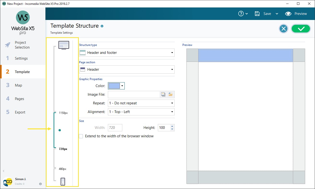
- Go to Step 2 and access the Template Structure window: as you are creating a responsive website, you will find a Responsive Bar on the left.
- The Responsive Bar displays all the intervals which result from the breakpoints set up in the Resolutions and Responsive Design window: select the Desktop viewport and use the available options to specify how the template must appear in this viewport.
- Once the Template for the Desktop Viewport is complete, select the next interval on the Responsive Bar and make the necessary changes to the template.
- Follow this procedure for all the intervals in the Responsive Bar, making the appropriate changes to the Template for each one.
#tip - Default templates. All the default templates in WebSite X5 are optimized for creating responsive websites: this means that a certain set of breakpoints is set up by default for each template and becomes active when you select the Responsive Site option in the Resolutions and Responsive Design window. You can change these default breakpoints as necessary.
When the template layout has been defined, you can customize the Header and Footer: these sections may also vary according to the resolution the Website is displayed at.- On Step 2, go to the Template Content section. Because you are working on a responsive website, the Responsive Bar also appears in this window.
- Select the Desktop viewport interval on the Responsive Bar and create the template's Header/Footer.
- Select all the intervals in turn on the Responsive Bar and make the necessary changes for each one.

- In each Viewport, it is possible to:
- Add new Objects. The new Object will be visible in the current and following Viewports, but not in the previous ones (where it will be automatically hidden).
- Hide Objects. Select an Object, then click on the
 Show/Hide Object button and indicate whether it is to be hidden only in the current viewport or in all subsequent Viewports.
 - Show previously hidden Objects. Click on the
 Show/Hide Object button to open the menu and then click on Hidden Object Management. A new window opens where you can select the Object to work on and select the Visible option.
 - Change the position and/or size of the Objects. All the other object properties remain unchanged in all the Viewports.
#tip - Automatic re-positioning. It may be that some Objects are not completely visible in some Viewports: in this case they are automatically re-positioned, which means they are moved but not re-sized. You may find that some Objects now overlap each other. Use the Preview to check how the Objects behave in the Header and Footer in the various breakpoints.
| Number | Title | Author | Date | Votes | Views |
| 73 |
Website not working in smartphone view (6)
author
|
2020.07.16
|
Votes 0
|
Views 1338
|
author | 2020.07.16 | 0 | 1338 |
| 72 |
LiveChat Object. How to add a chat
author
|
2020.07.16
|
Votes 0
|
Views 1330
|
author | 2020.07.16 | 0 | 1330 |
| 71 |
RESPONSIVE DESIGN TROUBLES (2)
author
|
2020.07.16
|
Votes 0
|
Views 1566
|
author | 2020.07.16 | 0 | 1566 |
| 70 |
How to check the correct functioning of a responsive Website using the local Preview
author
|
2020.07.16
|
Votes 0
|
Views 1333
|
author | 2020.07.16 | 0 | 1333 |
| 69 |
How to change Header and Footer
author
|
2020.07.16
|
Votes 0
|
Views 1350
|
author | 2020.07.16 | 0 | 1350 |
| 68 |
How to manage the contents of a responsive website
author
|
2020.07.16
|
Votes 0
|
Views 1472
|
author | 2020.07.16 | 0 | 1472 |
| 67 |
How to set up a redirection according to the device resolution
author
|
2020.07.16
|
Votes 0
|
Views 1310
|
author | 2020.07.16 | 0 | 1310 |
| 66 |
How to correctly report the Desktop and Mobile URLs in the page code
author
|
2020.07.16
|
Votes 0
|
Views 1486
|
author | 2020.07.16 | 0 | 1486 |
| 65 |
How to create the Desktop and Mobile versions of a website
author
|
2020.07.16
|
Votes 0
|
Views 1333
|
author | 2020.07.16 | 0 | 1333 |
| 64 |
How to create a Responsive Website
author
|
2020.07.16
|
Votes 0
|
Views 1349
|
author | 2020.07.16 | 0 | 1349 |